
AnchorNet Global
Website redesign and brand system for a B2B IT infrastructure and cybersecurity services company.
In short
Problem
A generic site-builder template that never showed the company's main promise: an engineer on site in under an hour.
My role
Strategy, copy direction, UI, a Figma design system, brand refinement and a custom WordPress build.
Outcome
Approved by the client and launched on 28 October 2026.
Client
AnchorNet Global
Industry
Enterprise IT, network infrastructure and cybersecurity (B2B)
Role
Web and brand designer (strategy, copy direction, UI, design system, build)
Tools
Figma, AI prototyping tools, Claude, Claude Code, WordPress
Year
2026
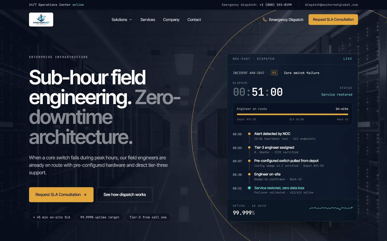
Brief and challenge
The brief
AnchorNet Global sends engineers to fix enterprise network, security and infrastructure problems on site, under a contractual sub-hour response. Its website was a site-builder template. The client pointed to servicepoint.com as a site they admired, asked for something that went further, and gave me creative freedom on the design and the brand.
The challenge
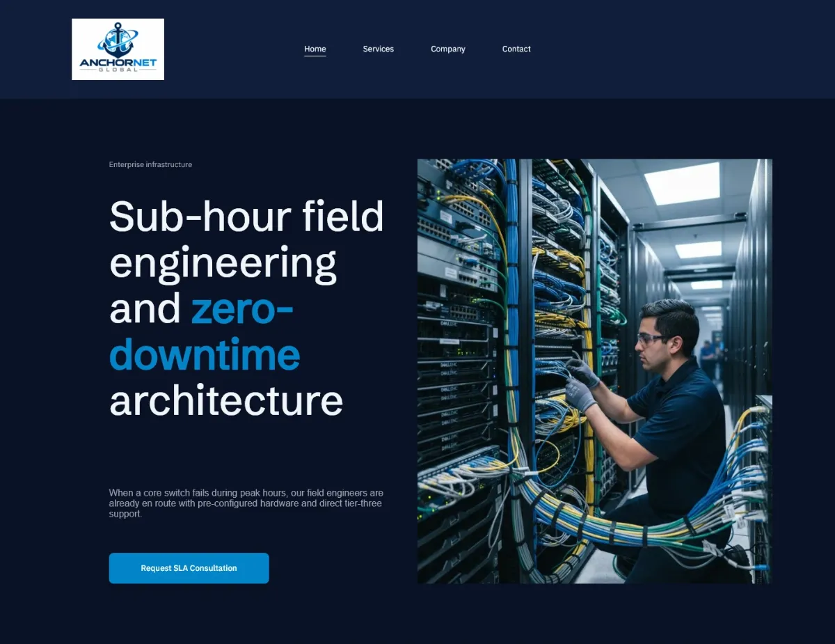
The template looked like every other IT provider. Nothing on it showed the sub-hour response the business is built on, the figures had no explanation, and the logo sat on a white box against the dark background. The buyers are IT directors and operations leaders at mid-market and corporate companies. They have sat in slow ticket queues before and want proof before they talk to sales.
Before and after
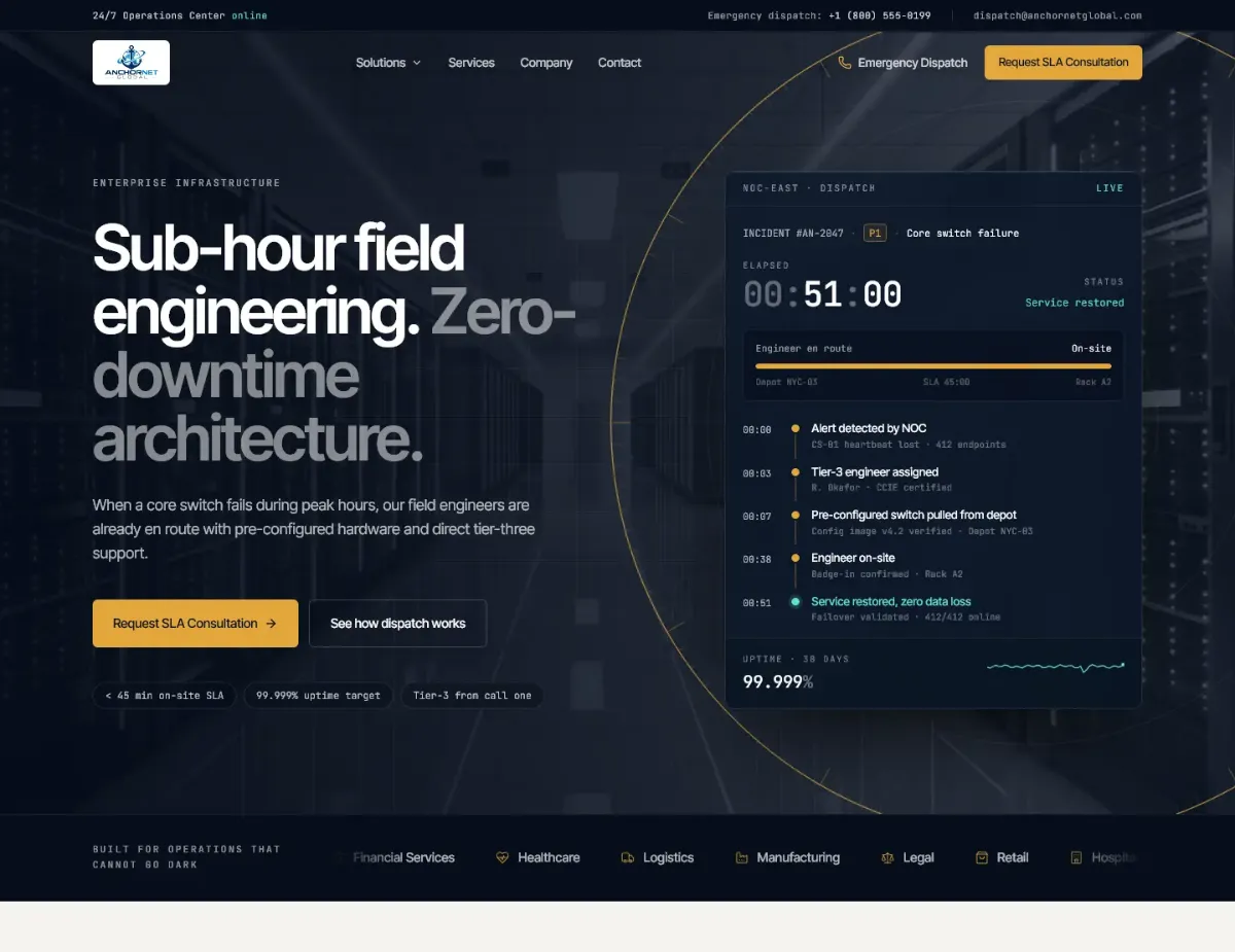
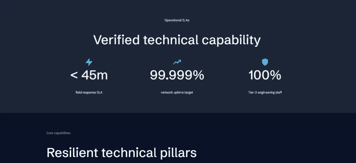
The same four homepage sections, before and after. Drag the handle, or focus it and use the arrow keys.
Hero
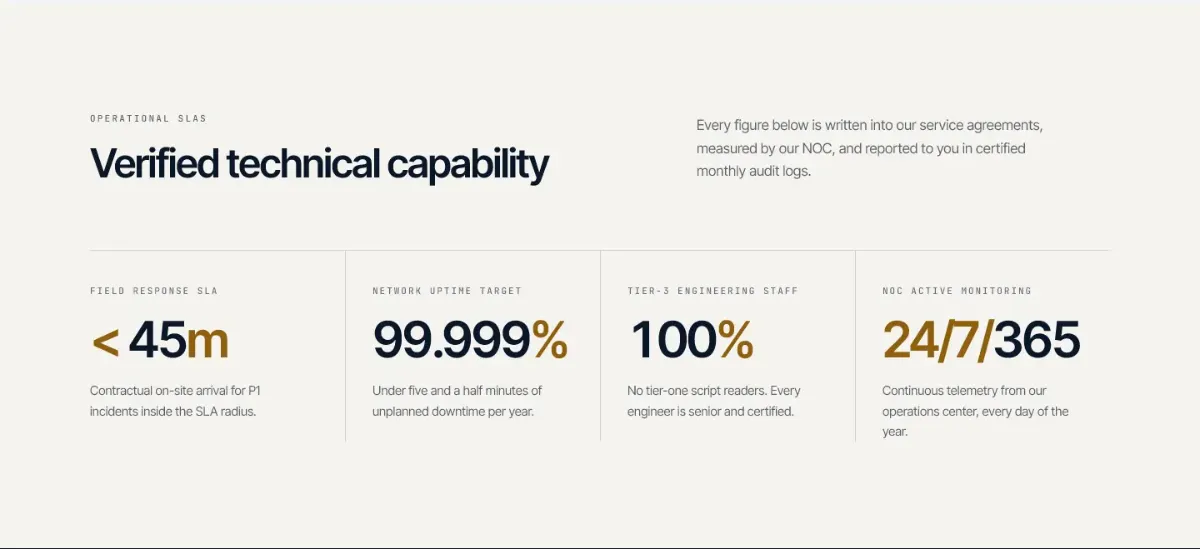
Proof
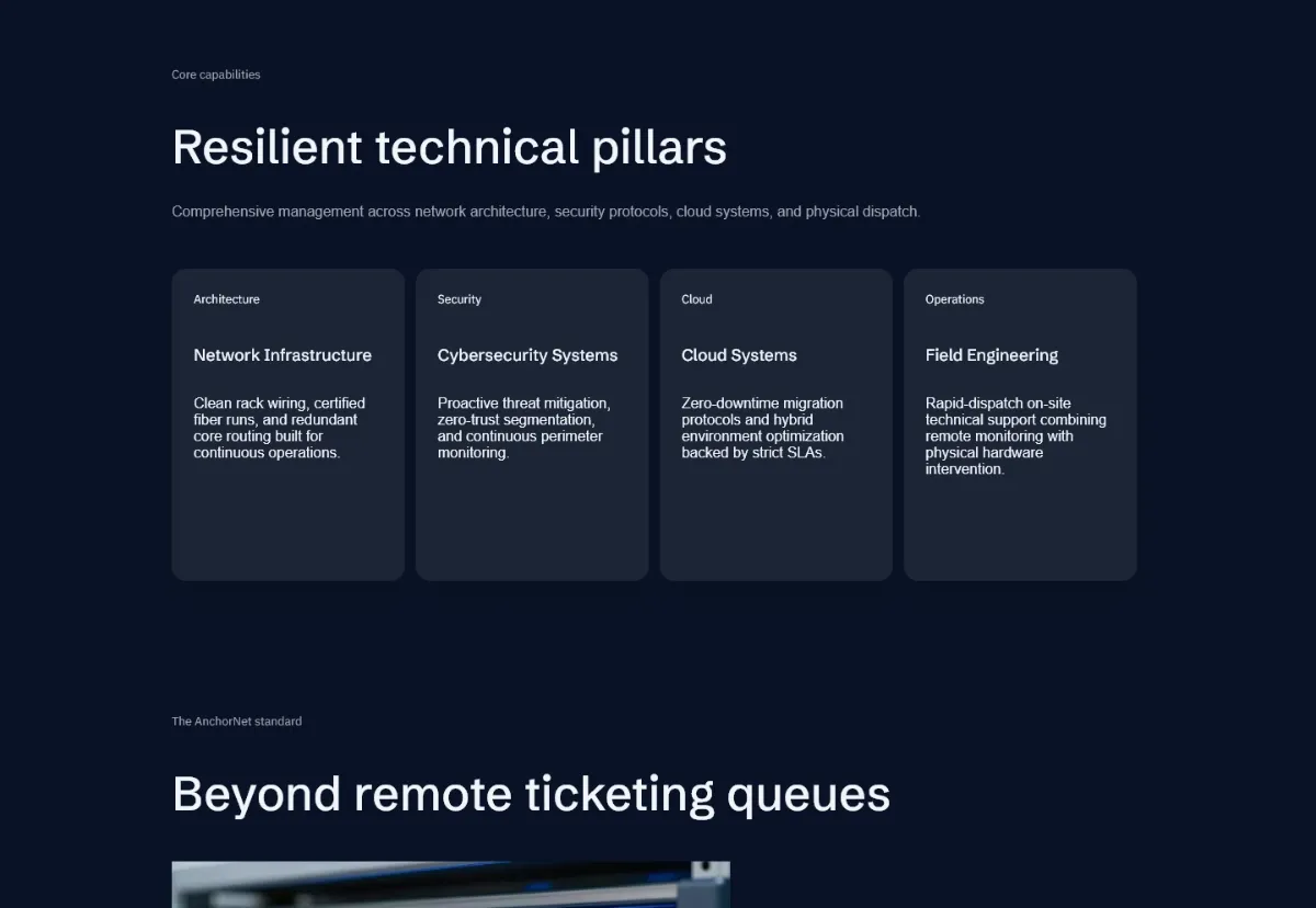
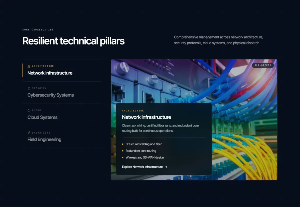
Capabilities
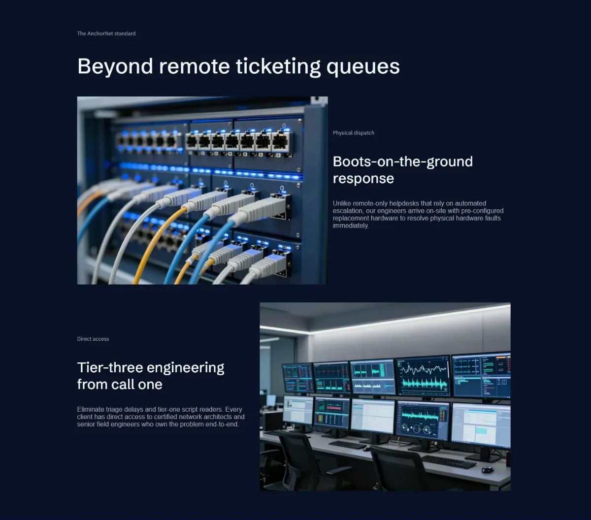
Differentiation
Added
Sections the old site didn't have, each answering a question buyers ask before they call.
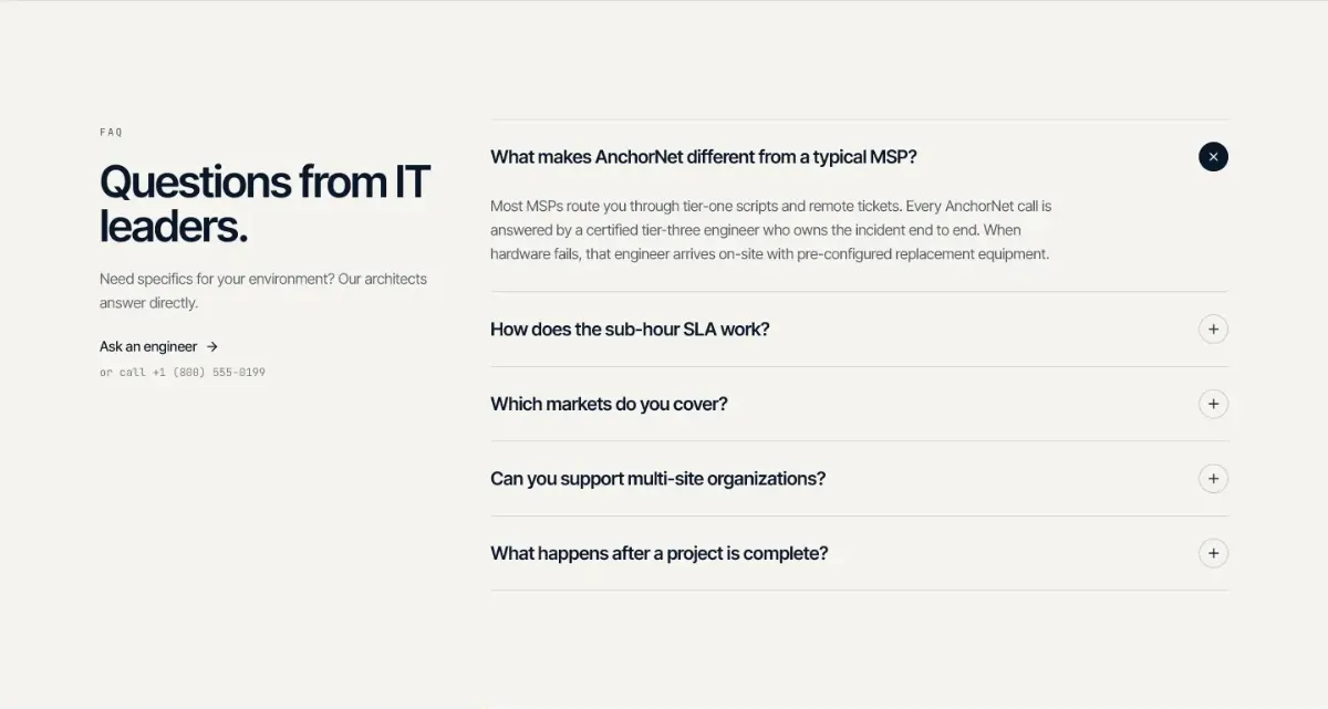
Mobile, 390px
Before
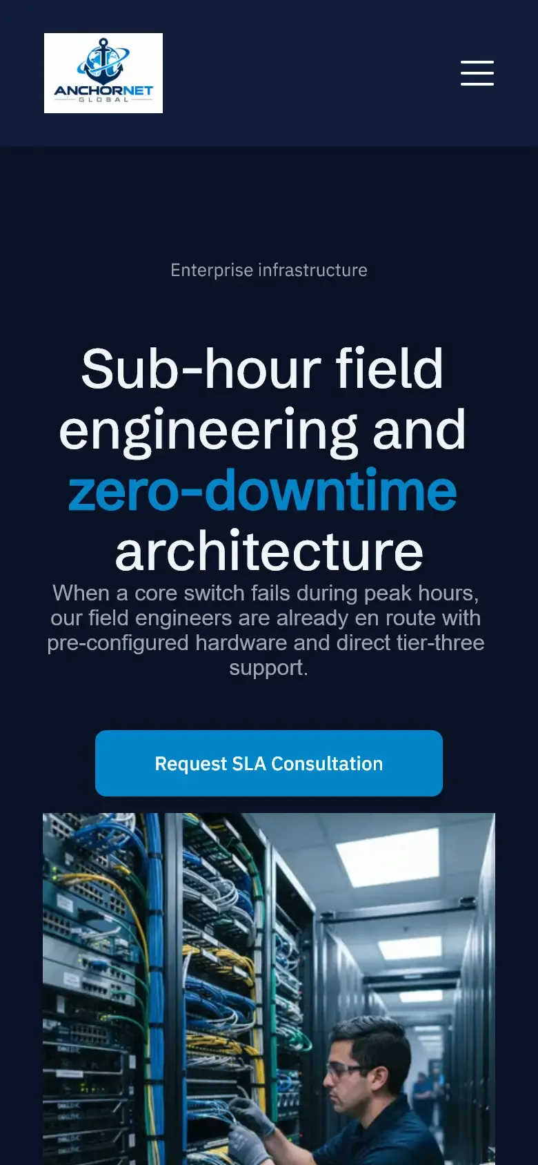
After
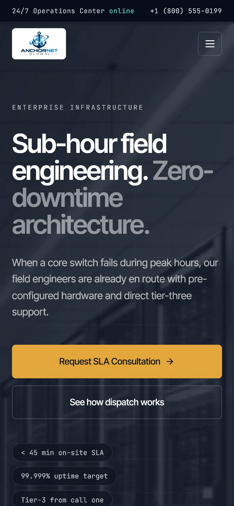
Full homepage
Before
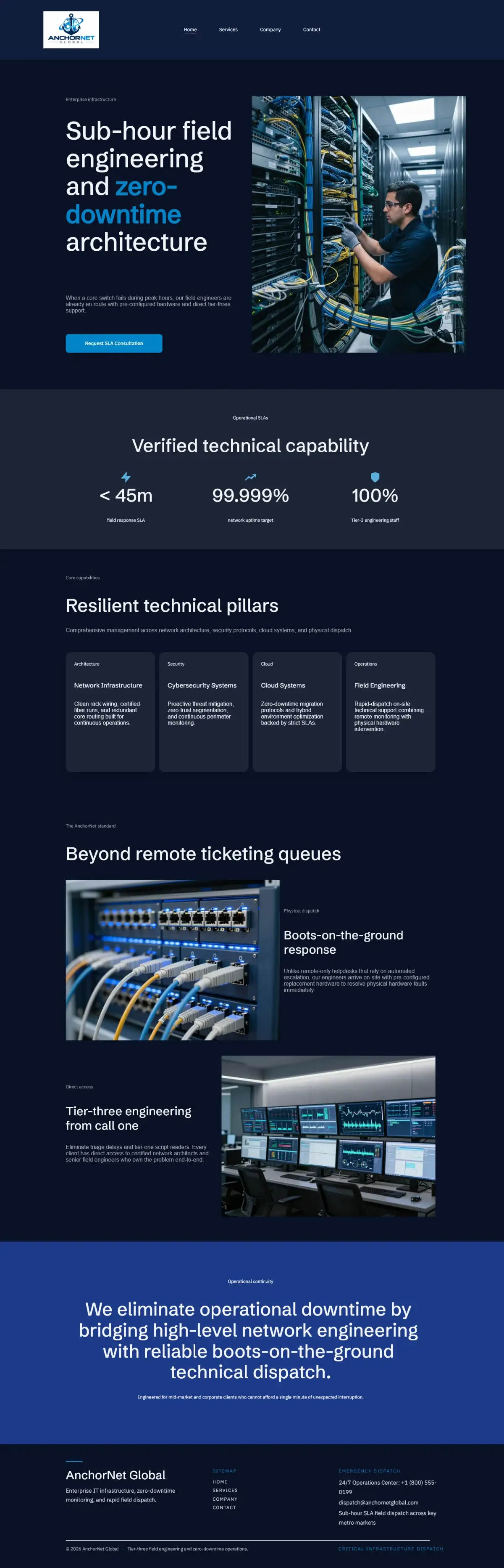
After

What changed
- The main promise, an engineer on site in under an hour, is shown in the first screen as a live dispatch panel.
- Every figure is a contractual SLA with a plain explanation, not a bare number.
- Four static cards became a tabbed capabilities explorer with detail for each service.
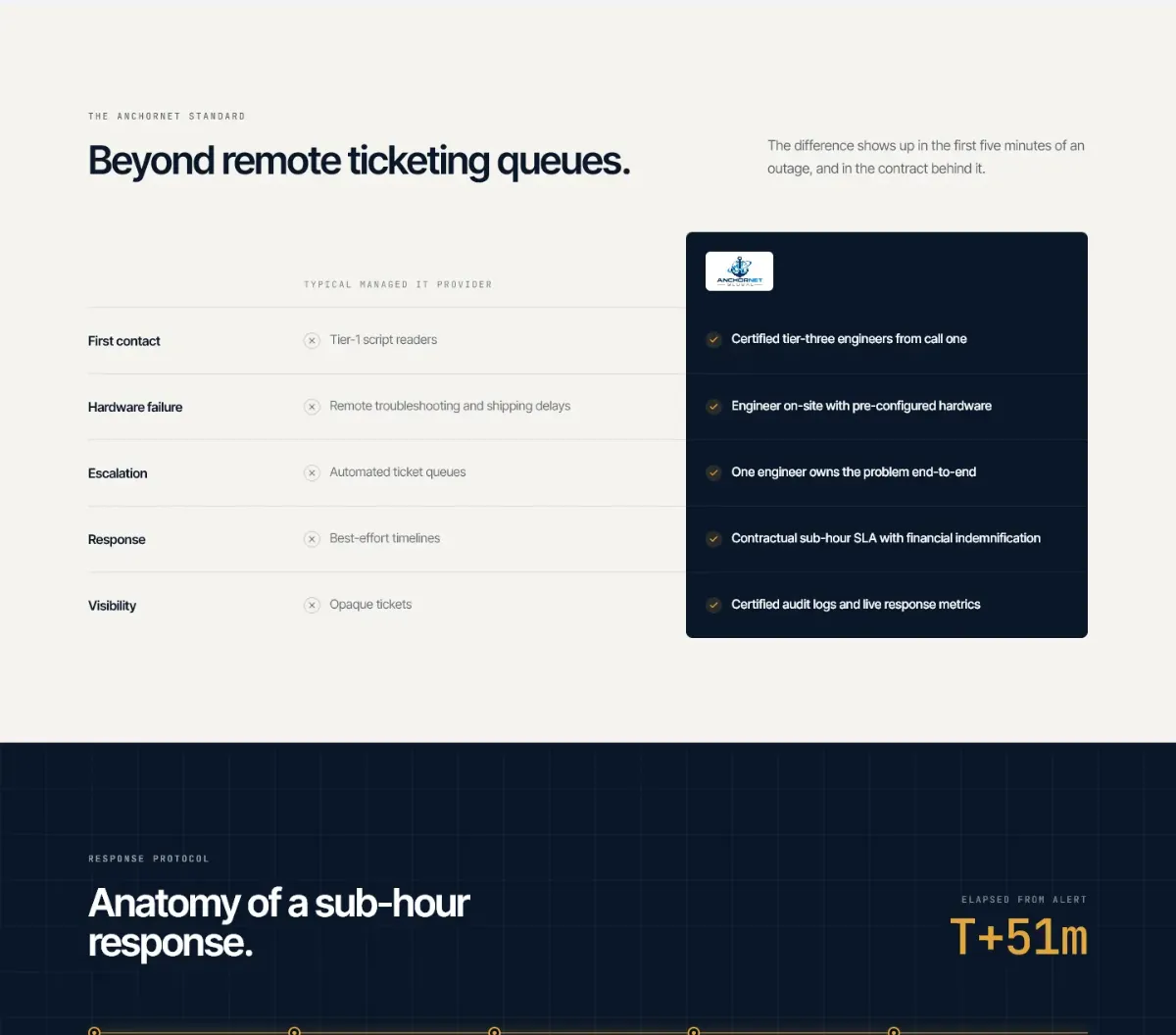
- A comparison table shows how AnchorNet differs from a typical managed IT provider.
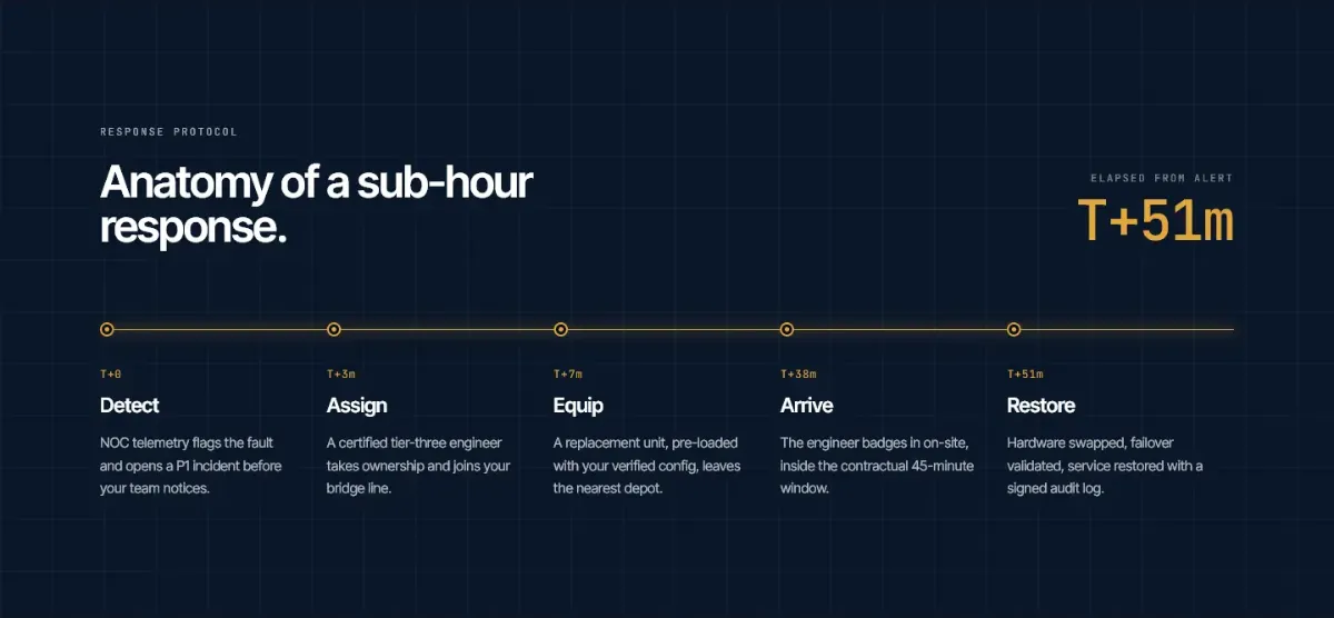
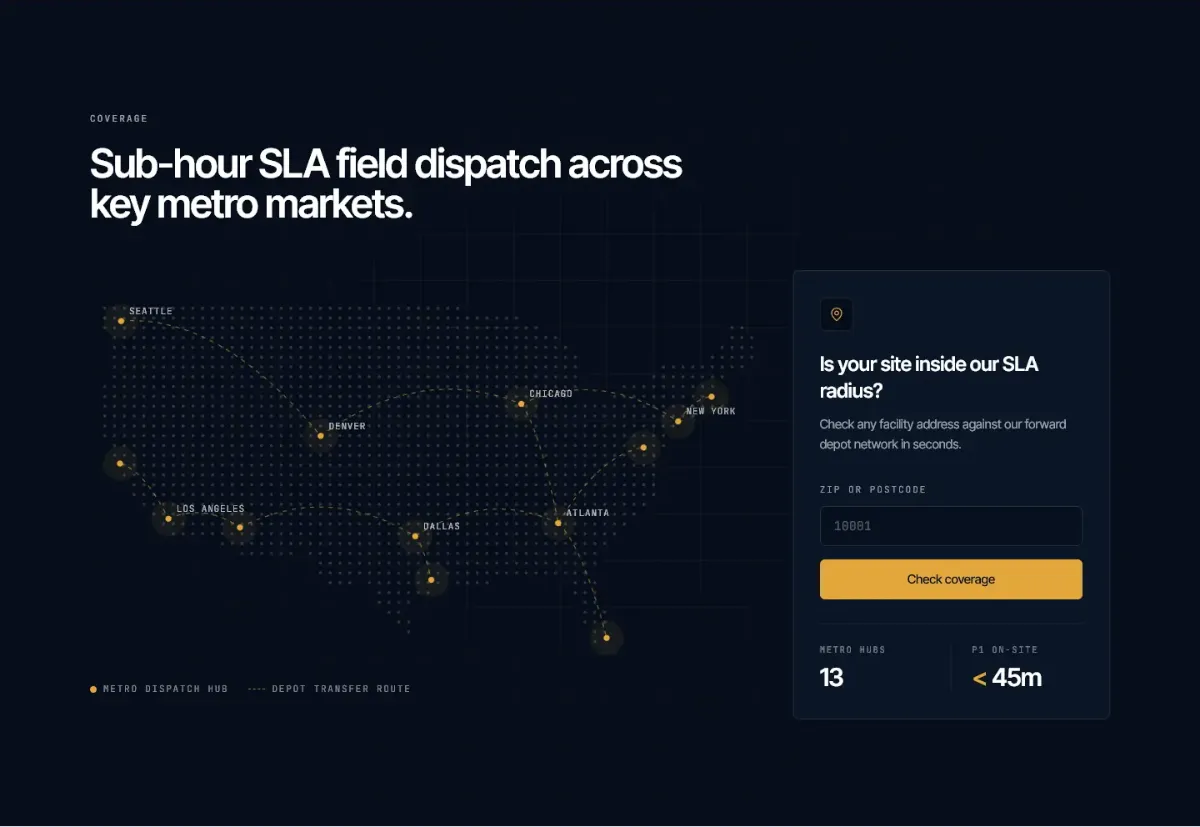
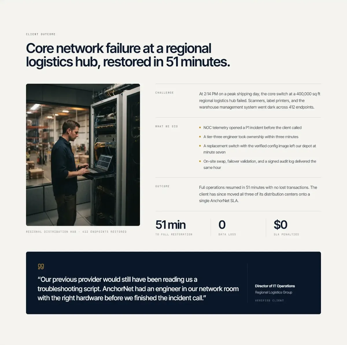
- New sections answer the questions buyers ask: how the response works, where AnchorNet covers and what happens next.
- One visual system across the site: deep ink, one amber signal and monospace labels for data.
- A custom WordPress build, so the client's team can edit every section without touching the layout.
Strategy and positioning
Three decisions that shaped the site: what I chose, why, and what it replaced.
One promise: an engineer on site in under an hour
Decision
Build the homepage around the sub-hour on-site response, starting in the hero.
Why
It is the one thing a typical managed IT provider can't offer, and it is written into AnchorNet's contracts.
Instead of
A list of services with equal weight, which is what the old template showed.
Constraint
Every figure on the page had to be one the client can stand behind in a contract.
Design from the buyer's world: the operations centre
Decision
Borrow the look of a network operations centre (NOC): dark screens, live status, monospace data.
Why
IT directors spend their day in dashboards and status pages. The site uses their visual language before it says a word.
Instead of
Stock photos of server rooms and generic blue technology gradients.
Constraint
It still had to read as a calm, dependable company, so one accent colour and plenty of space.
Each section answers the next buyer question
Decision
Order the homepage as the questions an IT director asks before calling sales.
Why
A buyer can stop at any section and still have a reason to book a consultation.
Instead of
The old order: hero, three numbers, four cards, two photo blocks, footer.
Constraint
Every section needed its own editable fields, so the client can keep the answers current.
Homepage order
Design system
Deep ink for trust, one amber signal for action and live status, and monospace labels for data, like telemetry. Everything in the Figma file is built from these variables.
Colour
- Ink #060E1A Page background
- Ink raised #0A1628 Raised surfaces, text on paper
- Ink panel #13233B Panels and cards
- Paper #F5F3EE Light sections
- Signal amber #E3A63B Calls to action and live status
- Live green #4ADE80 Online and restored
Type
Sub-hour field engineering.
NOC-EAST · DISPATCH 00:51:00
Spacing
- 4
- 8
- 12
- 16
- 24
- 32
- 48
- 96
Radius
- sm 4
- md 6
- lg 12
- full full
Components
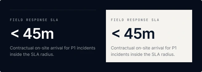
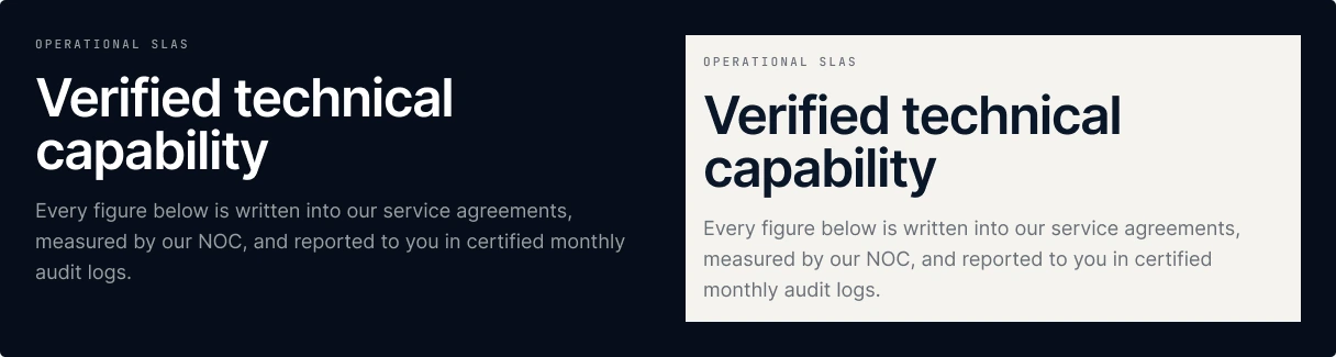

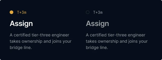


Handoff: variables bound to every component, component properties for states and themes, and five file pages: Cover, Foundations, Components, Website and Brand Kit.
The Incident Card
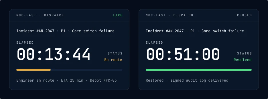
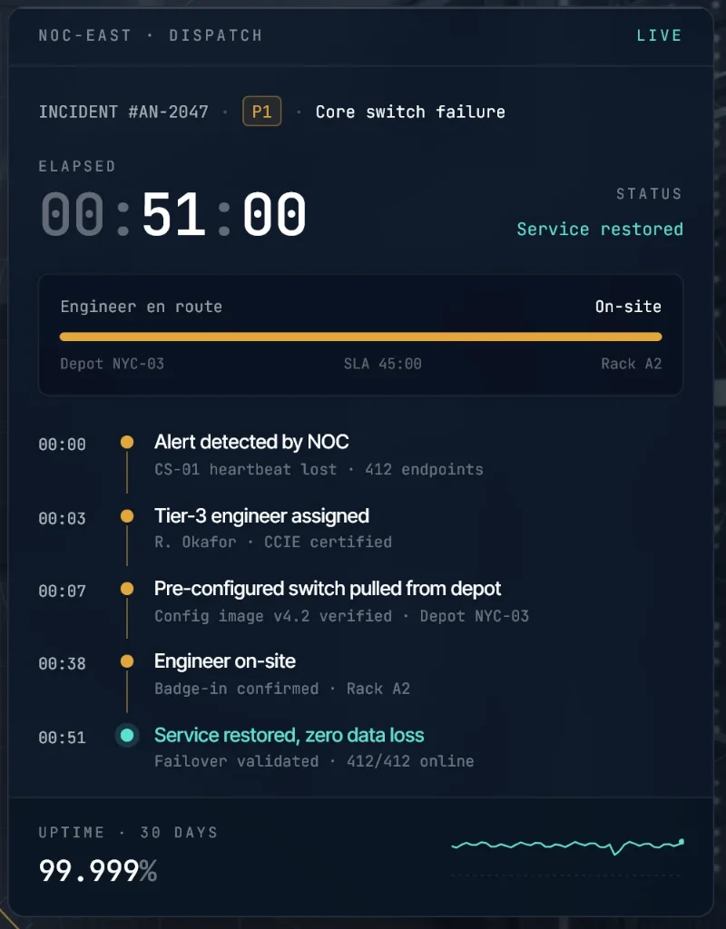
The Incident Card carries the main promise wherever the brand appears: the homepage hero, the LinkedIn banner and sales material. It has two variants. En route shows the live clock and an amber progress bar. Resolved shows the closing time, a green bar and the audit note.
Brand evolution
The brief covered the website, but the logo didn't work on it. I kept the existing emblem and refined it rather than replacing it.
Starting point
AnchorNet already had an anchor and globe emblem. It works on white, but on a dark site it has to sit on a white plate, which looks pasted in.

Fig. B1.1The existing emblem on paper, and on ink with its white plate. AI exploration
I used an image model to explore an amber version of the mark that belongs on dark backgrounds. The raw output had the right idea and the wrong execution, so I listed what had to change before it could be used:
- It was a flat image with the navy baked in. It needed rebuilding as a vector with a transparent background.
- The 3D shading and gloss fought the flat, technical interface, so the globe had to be flattened.
- Too many colours. Two only, with GLOBAL in white or amber instead of a tan gradient.
- The amber had to match the signal colour, #E3A63B, so the logo and the calls to action agree.
- One version wasn't enough: it needed full colour, single-colour white and a small icon.
- It changes the colour of an existing mark, so the client has to approve it.
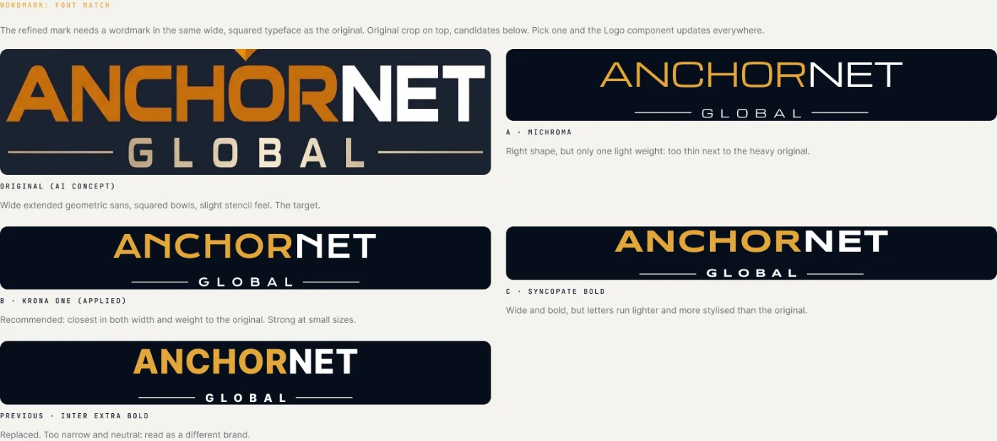
Fig. B2.1The raw AI concept, kept as a reference, not used. Fig. B2.2Matching the wordmark: four typefaces tested against the concept's wide, squared letters. Krona One is the closest in width and weight. Refined direction
Pending client sign-off
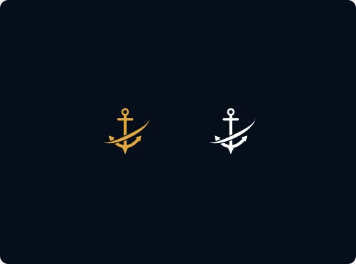
Rebuilt as vectors in Figma: a flat anchor, a wireframe globe for the network and the orbit swoosh, in full colour and single-colour white, plus an anchor-and-orbit icon for favicons and avatars. This is a proposal. The live site keeps the original logo until AnchorNet signs it off.
Fig. B3.1Full colour and single-colour white lockups. Fig. B3.2The simplified icon.



AI in the workflow
AI tools sped up the early drafts. The judgement stayed with me: what to keep, what to change and what to throw away.
Prototyping
AI prototyping tools turned my structure and copy direction into first layouts quickly, so the client could react to real pages early. I treated them as drafts and reworked the section order, copy and components by hand.
Logo
An image model produced a first amber concept. I critiqued it point by point and rebuilt the direction as vectors in Figma.
Copy
Claude helped me draft and tighten copy against the positioning. Claims and figures were checked with the client.
Build
Claude Code helped me turn the prototype into a custom WordPress theme and plugin, with editable fields for every section.
Mine
Positioning, section order, design decisions, quality checks and every client conversation.
Marketing assets
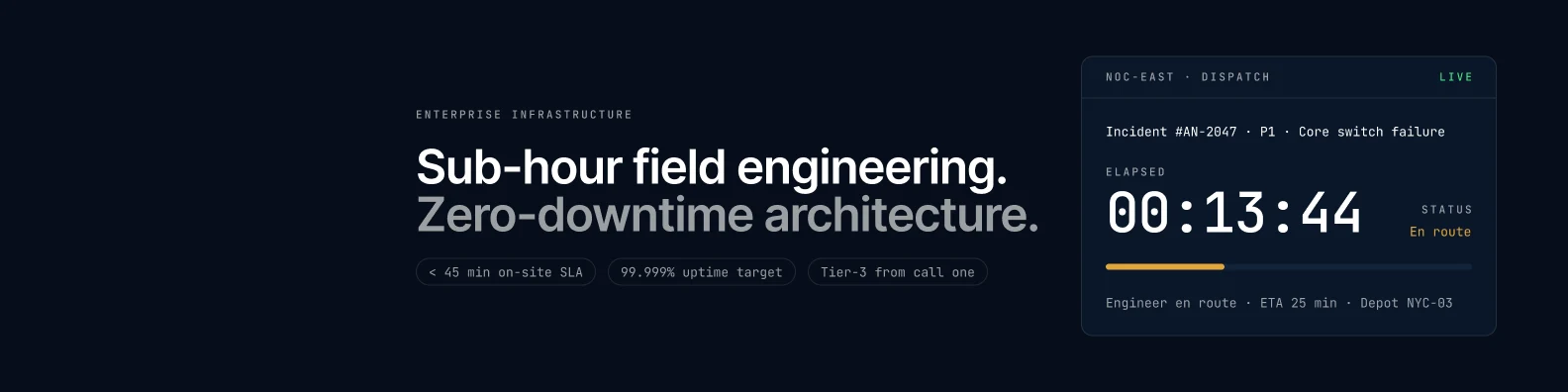
The design system extends past the website. The LinkedIn company banner reuses the headline, the proof chips and the Incident Card, so the company page and the site look like one brand.
Responsive
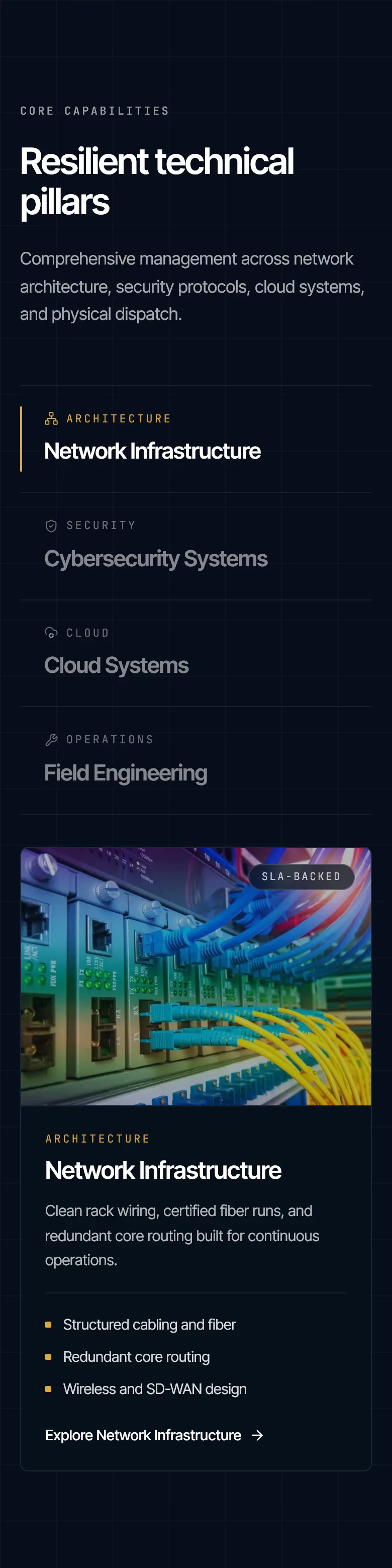
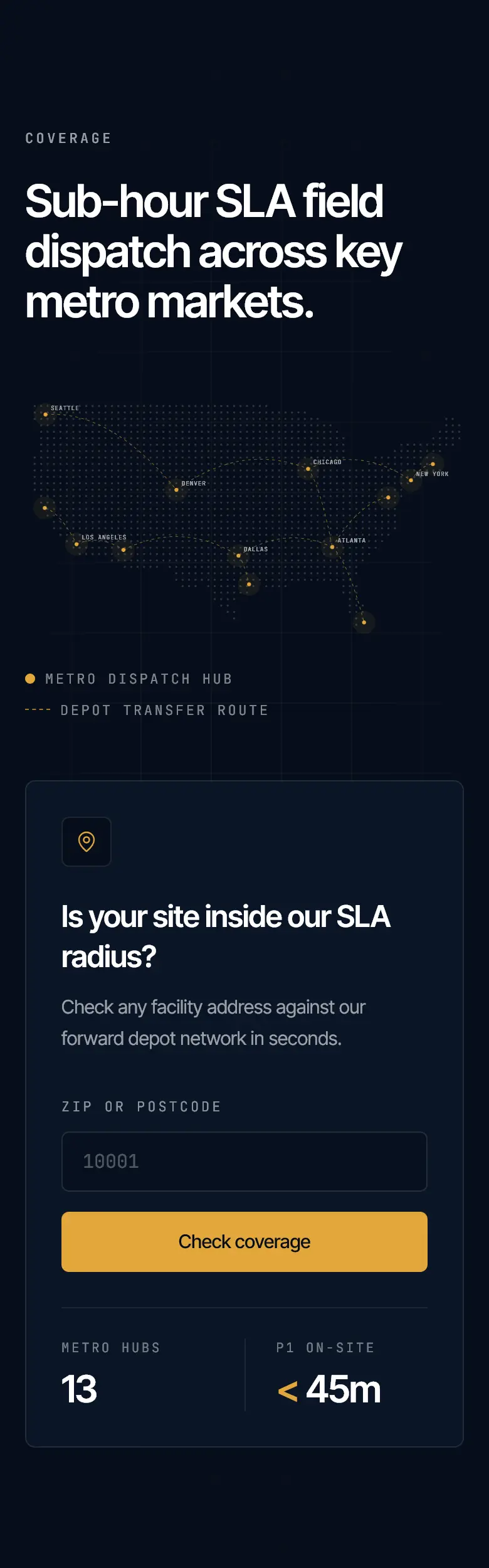
Every section was checked at 390px. The dispatch panel, the capability tabs and the coverage map stack into one column without losing content.
My role
Me
Strategy and positioning, copy direction, UI design, the Figma design system and brand kit, the logo refinement, and the custom WordPress theme and plugin.
Client
Business goals, the reference site, service and SLA details, and approval at each stage.
AI tools
First layout prototypes and a logo concept, both reviewed and reworked before anything shipped. Claude and Claude Code helped with copy drafts and the build.