
Orla
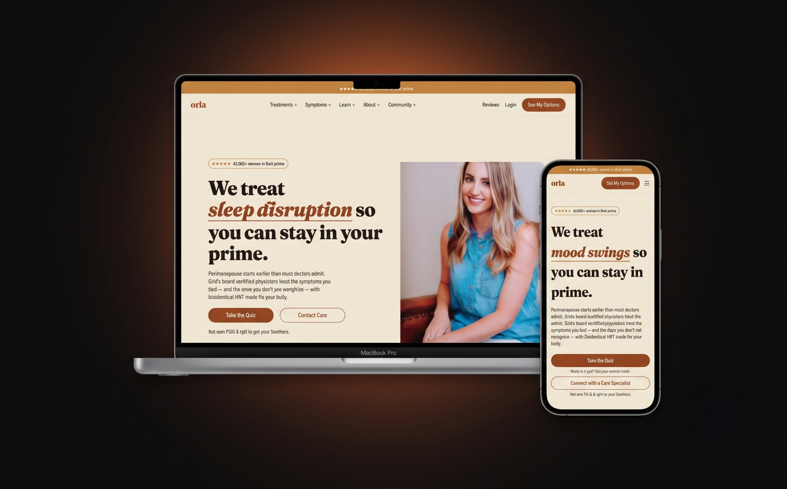
A 17-section telehealth homepage designed to make digital healthcare feel human.
In short
Problem
Healthcare sites tend to feel cold and clinical; too soft and they lose medical credibility.
My role
Design. Self-initiated, no client.
Outcome
A complete 17-section homepage that leads a visitor from uncertainty to booking a consultation.
Type
Concept project
Industry
Telehealth, wellness
Role
Design
Stack
Figma
Year
2026
Brief and challenge
The brief
A self-initiated exploration: design a telehealth homepage that breaks from the cold, clinical look of most healthcare sites and instead feels warm, personal and quietly trustworthy.
The challenge
Healthcare design walks a narrow line. Too clinical and it feels distant; too soft and it loses medical credibility. Across 17 sections, every type, colour and content decision had to hold that balance while guiding a visitor from uncertainty to booking a consultation.
Warmth, engineered.
Three decisions that shaped the build: what I chose, why, and what it replaced.
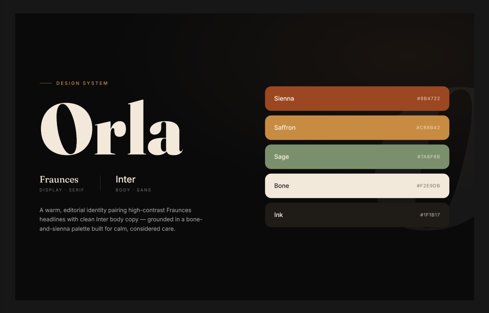
Warm earth, editorial type
Decision
A warm-earth palette with Fraunces for display and Inter for body text.
Why
The page should feel like care, not software, while staying credible.
Instead of
The clinical blue and white of most healthcare sites.
Tell it as a story
Decision
17 sections in a narrative arc: empathy first, service clarity second, proof and action third.
Why
A visitor arrives uncertain; the page earns trust before asking them to book.
Constraint
Benchmarked against leading direct-to-consumer health brands for tone and trust patterns.
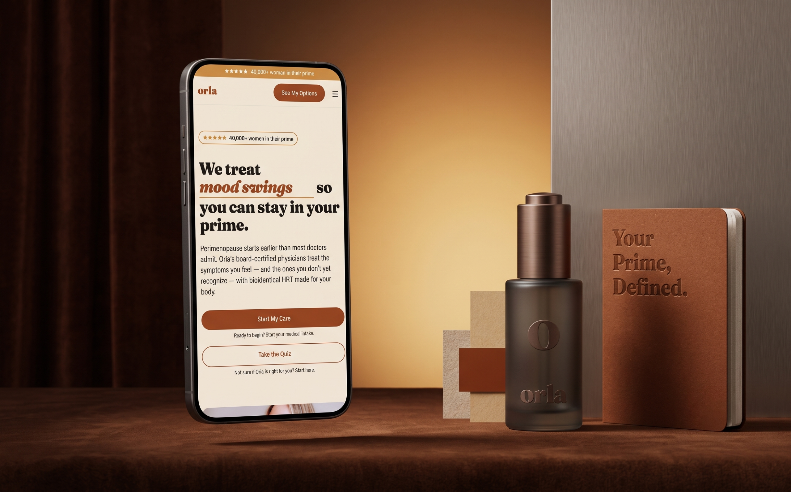
Design for the phone first
Decision
Every section designed mobile-first.
Why
Healthcare decisions increasingly start on a phone.
My role
I did
Research, narrative structure, design system and all 17 sections
Client
None. Self-initiated concept project
